[From Matti Kolu (2013.07.30.1315 CET)]
Martin Taylor 2013.07.30.1044--
It takes a bit of training to be
able consciously to perceive many of our lower-level perceptual signals.
This is normally the case. I think there are some posts in the
archives where Powers describes how he needed decades of careful
observation to come up with the proposed hierarchy, which many of us
probably consider to be rough starting point, if that.
But to quote the English physician William Harvey: "Nature is nowhere
accustomed more openly to display her secret mysteries than in cases
where she shows tracings of her workings apart from the beaten paths."
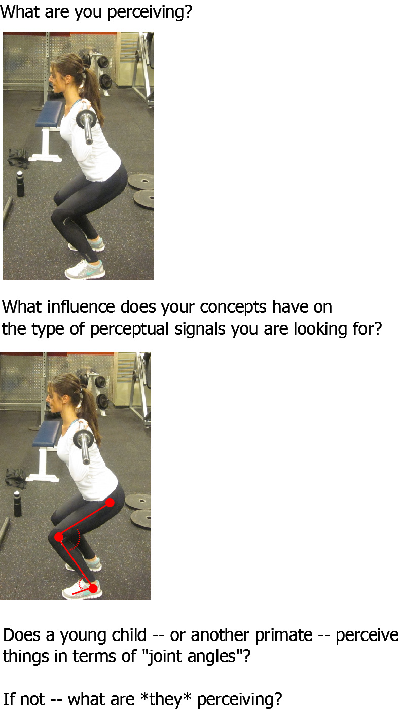
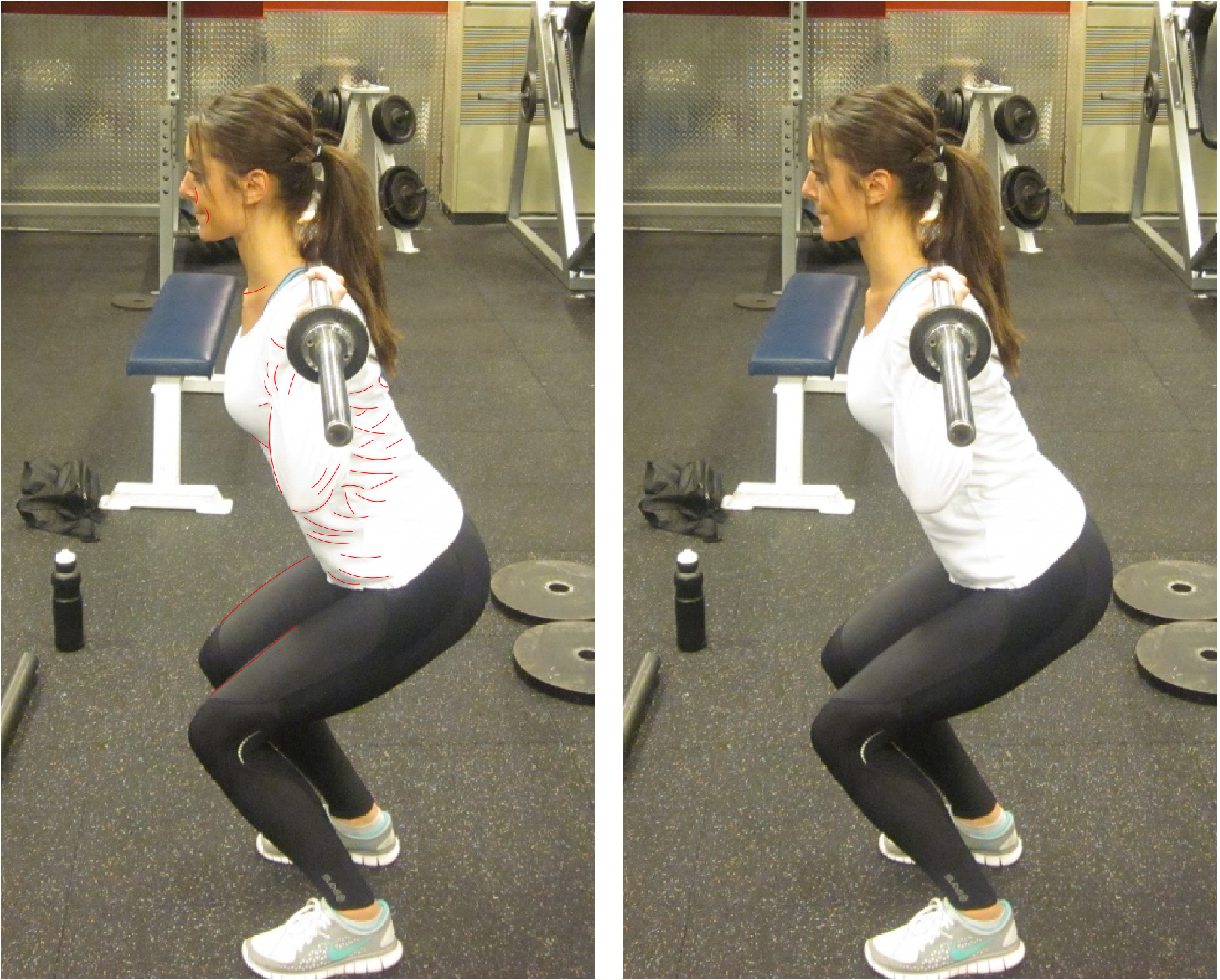
Here is a partially marked up image of the squatting woman according
to what I find most pertinent about it:
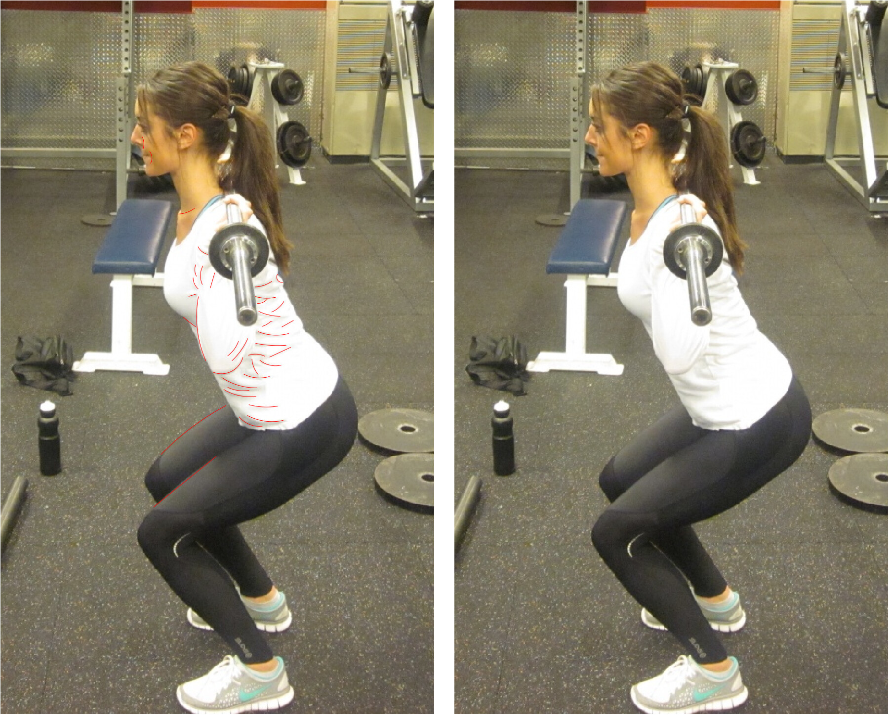
There was little effort involved in this. I didn't have to force
myself to only pay attention to certain aspects of the image. The
things the red lines represent stand out extremely clearly to me --
not only in static pictures, but in real life.
What would you say that my markings represent? Would you say that they
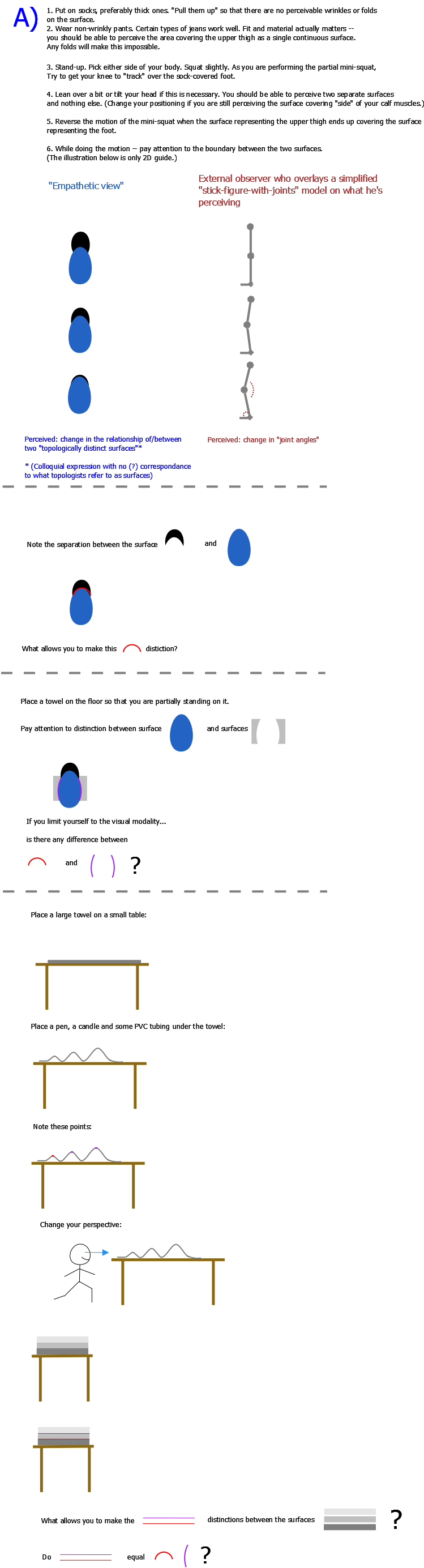
are related to the distinctions I tried to illustrate in the sketchy
drawing that was attached earlier?
Note the area of the image where most of the markings are found.
There's really nothing special about fabrics per se. But due to the
flexibility of textiles they naturally end up with wrinkles and folds
that create easily-discernable distinctions that I'm currently
perceiving *everywhere*.
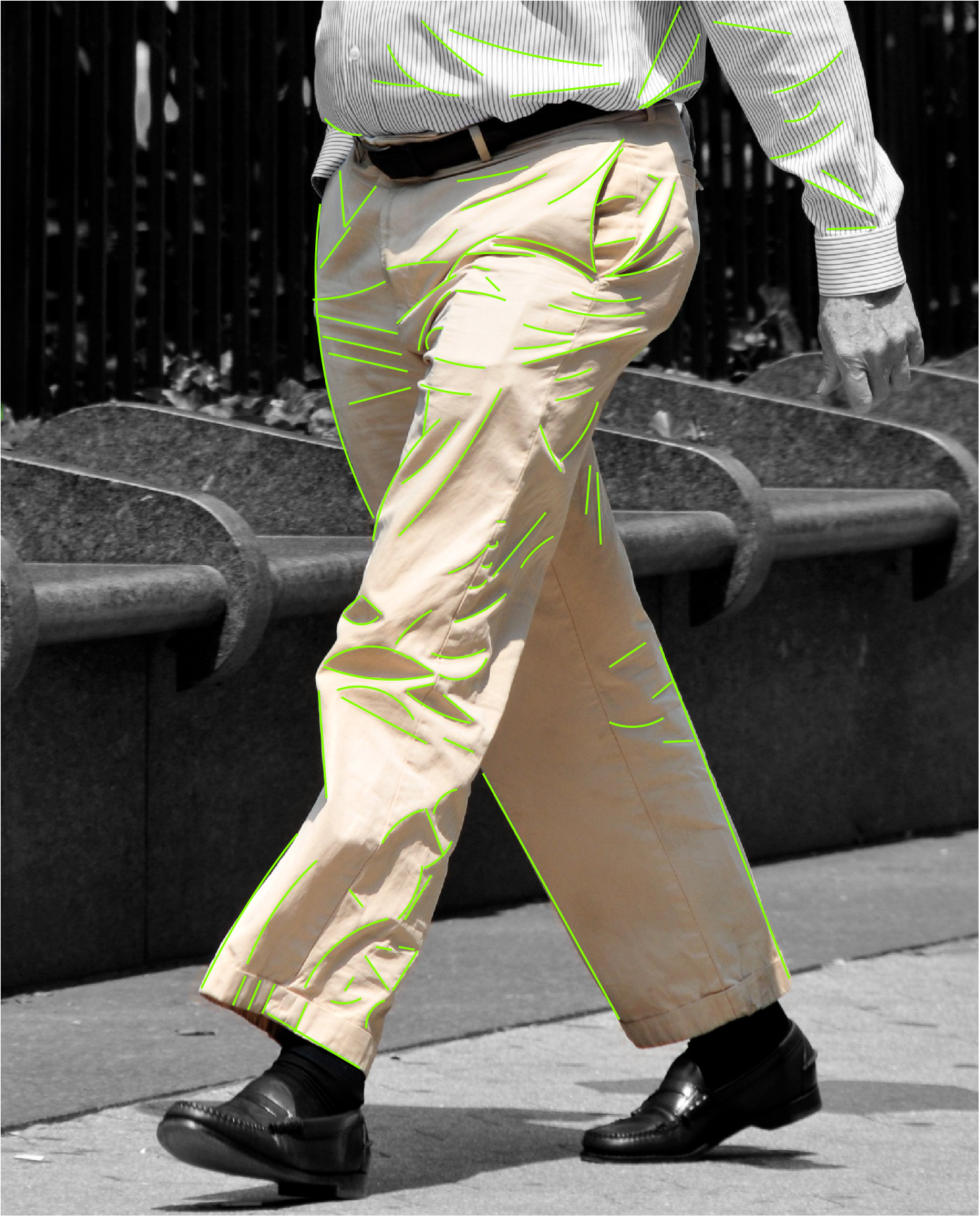
Here's another partially marked-up example:
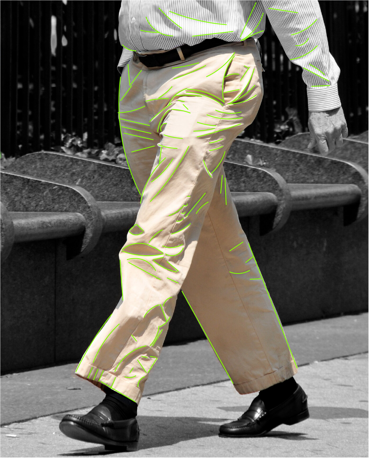
Think of a uniformly colored flag in the wind. Or curtains by an open
window. A single-colored dress draping around the body of a woman as
she's walking. The changing nature of those surfaces make them
extremely noticable.
Note the also the lack of wrinkles and folds around the woman's thigh
area. Look at the leg closest to you as a viewer. There are two types
of fabric used in her workout pants. The shinier material creates an
edge when it meets the less shiny material. This does *not* -- at
least not in this particular image -- create the distinction that I
find relevant.
This is not about simple edge detection.
"Logically" and for the sake of consistency there should probably be a
red outline around the squatting woman's body. The lack of this
outline is actually important: the distinction is easiest to make when
two plain surfaces are contrasted with each other. That's one of the
reasons for why the sketch includes the part where I tell you to stand
on a towel. (Although the towel will be changed to something like a
fine-threaded pillow cover in future revisions -- the rought texture
of most towels might distract from the point I'm trying to make.) The
towel, or pillow cover, is there to make the contrasting background as
uniform as possible.
Matti