BN: However, the adder is properly part of the environmental feedback function.
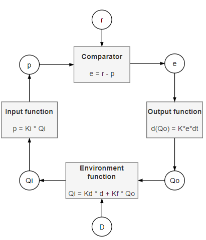
Ok, fair play. I’d reserve the name “feedback function” for Qf = Kf*Qo, but the “Environment” function in Demo2 (equation #1) is the lumped function Qi = Kf * Qo + Kd * d. This makes the diagram pretty nice and symmetric. Maybe the output function needs a bit of work. I don’t care too much for circles around variable names, but it is consistent.